Tuesday 22 January 2013

Alcohol Inks Done Different

 
Victoria inspired me to bring out the alcohol inks the other day!  I used Meadow, Citrus, Lemonade, and Terra Cotta along with pressurized air for my computer.
 
Once I finished blowing the inks around I used the blending solution and put a drop in the middle of each colour.
 
There was still too much white glossy paper showing so I took a leap of faith and went around the edges with Distress Wild Honey.  The edges turned out great so I went even further to colour in all white areas.  I kind of like how it turned out!
 
The butterfly stamp is by Penny Black and one of my favourites.  It was stamped in Archival Black.  Once the ink was dry I used Lime Green Stickles to colour in some of the areas and the body. 
 
Here is a closer look of the Stickles..


Thanks for looking!

Hugz,
Sheree

Twelve Tags Of 2013 - #1

Good Evening Girlz!

I went to the Tim Holtz blog at the beginning of January and have now put mine together from memory.  I have a feeling it isn't even close to Tim's but.. a valiant effort!  I will find out for sure when I check his after posting mine!


For my tag I had to improvise quite a bit.  The sentiment is one that I picked out for the recipient of the tag.  He is a friend of my son who has his degree and is now venturing into politics.  I hope he likes it!

The gears were painted with silver paint and then once dry, rubbed with a VersaMark pad and sprinkled with Stampendous Aged Taupe Embossing Enamel and sprinkled with Zing Black glossy embossing powder. 

The film strip that Tim used wasn't available here so I used a ticket die and acrylic from a Spellbinder package.  I rubbed THoltz silver paint dauber and rubbed it in with my finger... and removed some as well.  This gave it a cloudy effect.

Tim used a pointed finger stamp which I didn't have so I cut one out with my Cricut using the Going Places cartridge.

The tag itself was distressed and then I stamped the Hero Arts Watch Gears stamp using Vintage Photo.  I quickly poured clear embossing powder over it all which gave it a nice glossy finish.

The strip with the sentiment was first stamped with Hero Arts Map of Americas using Distress Frayed Burlap.  The edges were distressed and then I used Vintage Photo on the edges.

My ribbon was first stamped with Archival Black, dried and then rubbed in Distress Honey.  It didn't turn out as I had hoped but... you live and learn!

Here are some closer views so you can see what I have been talking about!


The recipe is...
Stamps - Hero Arts Clock Gears and Map Of Americas
Inks - Distress Iced Spruce, Wild Honey, Vintage Photo, Gathered Twigs
          VersaMark
Embossing Powders - Ranger Super Fine Clear, Stampendous Aged Taupe Enamel, Zing
Dies - Tim Holtz Gears
Cricut - Going Places Cartridge
Paper - Recollections, Staples 110 lb.
Seam Binding

Thanks for looking!

Hugz,
Sheree

Saturday 19 January 2013

A Bunch Of Odds & Sods

Good Evening Girlz...

I was doing some playing one night this past week.  Quite a while ago I bought a set of stamps at a garage sale.  I know they are from around 2005 but don't have the name from Stampin Up.  I tried stamping with inks a couple of times and nothing seemed to work so I put them away and almost gave them away!  I am now glad I didn't and kind of like how these turned out.  The key this time around was to use VersaMark and then heat emboss with Ranger super fine detail embossing powder.

I think the stamps can work for thank you cards or even Valentines


I am not sure whether you can see the detail from these photos but if your screen is big enough you just may see it!


Thanks for looking!

Hugz,
Sheree

For My Cricut Lover Buddies!

Good Afternoon Girlz!


I clicked on a visitor's blog that showed up on my stats, Trails of Paper
and while looking around at her beautiful work I spotted a button on her side bar for Cricuts.  So... I clicked on it and boy did I ever hit the jackpot!!!

My Cut Search has lists of carts but here is the kicker!  On the home page you can type a word into the search box and it will tell you which carts have characters or images of what you need.  Then, you can pick from the list of photos for the one you want and so on.

I don't know how many times I have sat down thumbing through all of the cart books to find an image that I want.  A lot of them are not put on the back of the box so you have to find them by trial and error and... try to remember where you found it the next time around.

Head on over and have a look!  I love saving time because I just don't have much of it to spare and finding this site made my day!

Hugs,
Sheree

Sunday 13 January 2013

Bugaboo Stamps Challenge at The Outlawz

Good Evening Girlz!

The Greeting Card Challenge at The Outlawz for the week of January 14th.  I am posting a couple of hours early but it has been a crazy schedule lately.

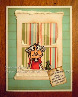
The Bugaboo digi that I picked for this weeks challenge is..Gus and I just love this cranky old guy!   This will be used as a Christmas card for one of our loggers this year.

One of the extras needed for this challenge is snow or snowman.  I picked snow for mine.


Here is a close up of the snow and glitter I added..
 
 
The recipe is...
 
Stamps - Bugaboo Digi
Memory Box Die - Grand Window
Papers - Recollections and unknown
MS Score board
Distress Ink Frayed Burlap
MS Clear Glitter
Snow
 
Thanks for looking!
 
Hugz,
Sheree


Saturday 12 January 2013

First Grandbaby Has Arrived!

Evening Girlz!

Just a quick post tonight.  Terrys son and wife had a baby girl this morning.. Livia River.  Not sure where the middle name River came from but I will get used to it!  She has ten fingers and ten toes so that means she is perfect!

I made this card last night while they were with the midwife at the hospital.  I wanted something to put a bit of money for take out food one nigfht when she is too tired to cook.  Up here, you are sent home within hours of having the baby if there are no complications.  Go figure.

I used the Cricut for most of the card..

 
This is the inside..


The recipe is..

Sentiments - Stamping Bella, Stampin Up
Cricut - George and Newborn
Papers - Recollections and .. Little Yellow Bicycle - Hello Spring
Inks - Distress Walnut, VersaFine
Embossing Powder - Zing red (it ends up being purple!)
Stars - Dollarama

Thanks for looking!
Hugz,
Sheree
 

Tuesday 8 January 2013

Something Different Valentine

Good Evening Girlz!

I headed to my rubber room tonight after doing some painting downstairs in the war zone.  Things should be dry enough to bring my great stuff home again!!

Back to tonight's post! 

I picked up a new embossing folder (errr... 2 actually) and decided to try this one out.  It is by Craft Concepts and called Celine.  It has hearts and on one side you can use a large circle punch or stamp, etc.  This is what I did with it and I will give you the steps below...Actually, IRL it looks like and feels like leather!  Go figure...


First off I cut red cardstock the size of the embossing area on the folder.  It looked pretty neat so wanted to accent the raised areas and did that with Distress Festive Berries.  The embossing looked fabulous but.. why stop there?!  lol  Yes, I brought out the clear embossing powder and lightly put that on so it stuck only where I put the Distress ink.  Looked really neat so...
 
I looked through my drawers.. the craft room kind, and saw some Antique Bronze Distress stain that I hadn't tried before so thought what the heck and lathered that over it all and immediately toweled some off.  Now it even looked neater so what the heck...add more clear embossing powder!  That was where I stopped though.  I was finally happy with the result!
 
For the circular area to the right I grabbed some dark brown cardstock and using the VersaMark pad I stamped the sentiment and birds then heat embossed them with ultra fine Ranger Gold embossing powder.  I still needed something so I used Distress Walnut to darken the edges and then... yes, Victoria, I used clear embossing powder on the distressed edges.  Mahvelous!! 
 
Here is a close up of the embossing although I couldn't get the camera to take a picture of how it really looks.  I guess the bronze areas reflected the light which made it all orange.  But, you get the idea!  Argghh.. I just noticed once again that my watermark is sporting the wrong year still!  Should be 2013!

The recipe is:

Stamp - Michaels dollar bin
Embossing folder - Craft Concepts / Celine
Paper - Recollections
Inks - VersaMark, Distress Walnut Stain, Distress Festive Berries
Ranger embossing powder - Gold and Clear

Thanks for looking!

Hugz..
Sheree


Sunday 6 January 2013

Stampscapes Valentine

Good Morning Girlz!

Here is an idea that I came up with while sucking all of the water out of the basement before the restoration crew got here!  Yes, while I was at the shop yesterday, the hot water tank blew.  Just wonderful.  It now seems that the wiring wasnt done right by the previous owner and that the wiring board had caught on fire as well.  I may have gotten home in time and with shutting down the power and water supply, the small fire went out!  To make a long story short, the other half of the basement that wasnt affected by the water backup last year was affected by the tank.  I am tired and want to move from this possessed house!

Okay.. On to the cards today....


These two Valentines were each done with one stamp for each.  Easy Peasy!!  I used Lakeside Cabin on one and Lakeside Cove on the other.  The Lakeside cove was not quite wide enough so I reinked the stamp and added it to the right hand side, on glossy paper.

The moon was done with a Fiskars heart punch and tacky paper.

To colour, I started with Lemonade around the moon using a Colorbox stylus.  Next, I used Distress Wild Honey around the moon, down through the middle of the scene.  Distress Worn Lipstick was tapped on from the outside edge towards the middle, working around the edges followed by Distress Festive Berries and then Distress Fired Brick.

Now that the colour was how I wanted, I carefully removed the sticky heart moon.  It was stark white so I added Adirondack Lemonade on the edges of the left side.  Now the scene looked like #&@? because the moon was still waayyy too light.  I had nothing to lose so took my VersaMark pad and dragged it across the scene from top to bottom and then covered it with clear embossing powder. (Yes Victoria...I LOVE clear embossing powder!  lol)  The scene was actually dull and bland but the embossing made the colours brighter and a lot richer as well.  I really like how the moon turned out because of this!  The VersaMark dragged some of the colour over the moon and created a slight streaking effect!

Heat embossing looks really neat on glossy paper!  Beware.. keep the heat gun moving because it can look like you are going to start burning it.  This is the result!....


 When putting the layers together I kept the layout simple so your eye will focus on the Valentine moon.  Being that this isnt frilly, it could work wonderfully for a guy card!

Here is the recipe...

Stamps
Stampcapes Lakeside Cabin, Lakeside Cove

Inks
Memento Black
Adirondack Lemonade
Distress Wild Honey, Worn Lipstick, Festive Berries, Fired Brick
VersaMark

Paper
Staples 110 lb, Recollections, Glossy

Brad - ?

Embossing Powder
Ranger Clear

Thanks for looking!

Hugz..
Sheree
 

Saturday 5 January 2013

Spam!

Good Morning Girlz!

I am apologizing in advance for having to go back to the original system for leaving comments.  For the next while there will be the verification letters to fill in.

For some reason, I am receiving hundreds of spam comments daily.  I get kind of bummed out at times but you have no idea how many people want to sell me Valium and diasepam and to top it all off they think I need Viagra to complete my transformation! 

They just don't understand that if I take all that crap I won't have the energy left to play in my rubber room!

Anyway... Have a wonderful weekend!

Hugz,
Sheree

Thursday 3 January 2013

Oh Valentine!

Good Evening Girlz!

I know.. We just entered into a new year and I am talking Valentines!  (Speaking of new year.. I just noticed my watermark still says 2012..oops!!)  The one I am posting tonight was fun to make.  If you want me to do a picture tutorial of the glossy parts just leave a comment below.  I have been playing around with distressing and this idea popped into my head so I headed off to the rubber room to  play with paper, ink and loads of embossing powder!!


 I started by cutting out the hearts using my Cricut and the Sweetheart cartridge.  The main white hearts were set at 5 1/2 inches.  Two were cut using the main scallop shape and two using the shadow option.  I embossed one scallop with Swiss dots and left the other hearts plain.  Using tape, join one scallop to each of the shadow cut hearts. 

 
The hearts were joined together by scoring the back hearts at approximately 1/2 inch.  Tape the back to the front and now start to decorate!
 
For the front I cut the  same heart using the shadow option at 3 1/2 inches.  I cant exactly remember if it was that or 3 3/4 inches.  Eeghad! 
 
I distressed the larger coloured heart using Distress inks and embossing powder.  Before embossing I used the Hero Arts music backgrund stamp and Walnut Stain ink for fun. 
 
The heart lock is also from the Sweetheart cartridge.  I cut that at 2 1/2 inches and distressed the red heart layer and embossed the heck out of it as well.  It is hard to show how dimensional everything looks in photos so trust me when I say everything really does look better in real life!!
 
 
I punched two holes to feed the black ribbon through.  The skeleton key on the inside was cut from a Tim Holtz die and distressed to look like wrought iron.


The sentiment inside was done on the computer and cut out.
 
 
There you have it!
 
Hereès the recipe...
 
Stamps - Hero Arts music background
Inks - Distress Walnut Stain, Fired Brick, Worn Lipstick, Wild Honey, Festive Brrries
Ranger clear embossing powder
Cricut - Sweethearts
Cuttlebug
Ribbon - Unknown from stash
 
Thanks for stopping by!
 
Hugz..
Sheree